|
Im
no art critic, but I think I can safely say that the
Virginia Museum of Fine Arts in Richmond has a splendid
collection of contemporary works of art. Ashamedly,
I must admit that I have shied away from becoming too
acquainted with 20th century art in the past,
especially because I grew up with very conventional
standards of art and beauty. Contemporary art seldom
jibes with convention, to say the least. But this course
has convinced me to reexamine my reluctance to embrace
modern art, and while I am still very far away from
being able to fully appreciate many of the artists
messages, I find their work extremely intriguing.
|
|
|
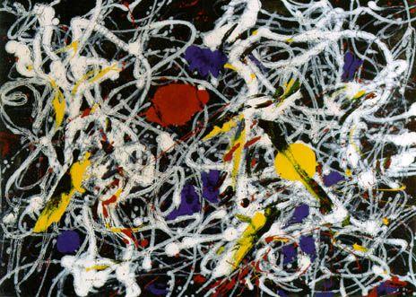
Jackson Pollock, "Number
15" (1948)
|
|
One
of the first paintings I looked at was by an artist I could
recognize: Jackson
Pollocks "Number 15" (1948). He is
one of a handful of contemporary artists who have crossed over
into the mainstream (like Andy Warhol), perhaps because
of his unique style of throwing the paint onto the canvas rather
than using brushstrokes. Usually, his works are quite large,
but "Number 15" was relatively small. However, it
probably started out as a much larger piece, as we learned in
class that he would often decide the dimensions of his painting
after, not before, he finished the determination of the borders
would become part of the creative process. For this work, the
panel description said that he first spread a layer of black
paint over the entire canvas, then dropped white paint while
the black was still wet, causing the white paint to feather
out in a very unique sort of way. The preponderance of black
and white in the painting gives it a sort of bleak look, while
the bits of color try to free the work from its desolation.
Most of Pollocks works jump out at me, as this one did, by
the sheer confusion of the lines that seem to have a mind of
their own and that care little about following any sort of convention.
|
| Another
painting in the collection that seemed to share some of
Pollocks seeming randomness and busy style was by Sam
Gilliam, called "Cities of America"
(1982). Although not nearly as risky as Pollocks work,
Gilliams was just as engaging, largely due to the emulsions
of acrylic paint and gel compounds he used to create a bumpy,
three-dimensional texture. Unlike Pollocks, Gilliams "America"
was much brighter and had a distinctly traditional American
countryside feel to it, thanks to the earthy colors (green,
brown, yellow) he used. Almost hidden beneath the randomness
were lightly drawn geometric shapes, perhaps representing
the juxtaposition of free-form nature and rigid architecture
found in Americas landscape today. |
|
Jorg Immendorf, "Cold
Courage" (1982) |
| Another
huge painting completed the same year as Gilliams was
Jorg Immendorfs "Cold Courage"
(1982), a fictitious representation of a post-war café
in Germany. From a "thumbs-up" giving Hitler
on the left to Mao seated at a table on the right and
the artist himself in the foreground, Immendorfs subjects
are much more clearly defined than Gilliams or Pollocks,
but he shares with them an incredibly detailed and busy
style. In "Cold Courage," the café was
full of flying dead horses, a variety of different people,
and pieces of something being carried out what was left
of Germany, perhaps, after it surrendered. |
|
| On the
other side of the spectrum we have Ad Reinhardts "Red
Painting" (1952). Although not the famous "Red Painting"
that seemed to show up on every website I went to, this one shared
its reductive style a simple collage of differently sized and
shaded red squares with no trace of brushwork at all. The focus
here was on the geometry and the subtle variations in color
if you stare at it long enough your eyes will play tricks with
you. Its simplicity and seeming homogeneity became mesmerizing,
as you found yourself searching for something to jump out at you.
According to the panel description beside the painting, Reinhardts
style led to the Color-Field and Minimalist painters who came
a bit later, like Ellsworth
Kelly. His "Four Panels: Green Black Red Blue"
(1966) was featured in the adjoining room, and Kelly shared with
Reinhardt a minimalist style, with no trace of brushwork and contrasting
colors. Here, however, the colors were much stronger, and there
was no need to search for differences the panels were obviously
different colors. "I am less interested," Kelly
revealed, "in marks on the panels than in the presence
of the panels themselves." Here, you found yourself thinking
about the spaces between the panels (which were separated by a
good deal of wall space), looking for whats hidden between the
objects rather than the objects themselves. The panel description
said it was a reflection of nature that whats going on in between
the trees is often just as beautiful and important as the trees
themselves. |
|
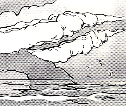
Roy Lichtenstein, "Gullscape"
(1964) |
| Roy
Lichtensteins "Gullscape" (1964)
is an extension of the above artists simplistic stylings,
although he adheres to the Pop Art formula more than that
of the Color Field painters. Here, Lichtenstein uses large
dots and simple, bold lines to create a comic-book sort
of feel. Adding to the fictional feel is the fact that
"Gullscape" is a painting of a bird flying over
a landscape on the horizon, giving it a sort of postcard-type
artificiality. As with most postcards and the places they
represent, they may look like paradise from far away but
once you get closer you see the irregularities among all
the perfection, the spaces in between the dots perhaps
similar to what Kelley intended for his "Four Panels."
|
|
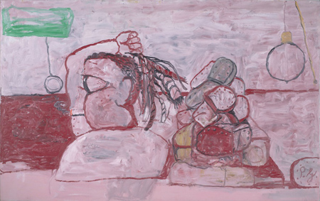
Philip Guston, The Desert, 1974 |
Philip
Gustons "The Desert"
has a similar cartoon-like feel to it
where else could you find a cigarette-smoking cyclops
with a whip in his hand and a pile of shoes behind him?
The overall red tint gives "Desert" a sort of hellish
atmosphere
theres one place youre glad youre not in.
|
| The sculptures
were impressive, too, and the Museum had a wide variety of them
ranging from the abstract to unnerving, lifelike presentations.
Sol Lewitts "1 2 3 4 5 6" consisted merely
of cubes stacked on top of each other; it is a simple concept,
but one that yield amazingly intricate and complex results when
one stares into the sculpture at an angle. The rows of lines in
each cube create a dizzying array of line arrangements almost
inconceivable if the original concept had not had been so simple. |
|
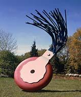
Claes Oldenburg,
"Typewriter Eraser" (1976) |
|
That idea
that things are more complex that they seem may have motivated
Claes
Oldenburg to create his monstrous "Typewriter
Eraser" (1976; a larger version of which again, the
only one available on the internet I have included). Rather
than persuading us to focus on its complexity, he probably wanted
to show how art can come out of everyday things when taken completely
out of context. I have never even seen a typewriter eraser, but
it still impressed me. |
|
The
exhibit I took a great liking to was the Realist collection,
both the sculptures and paintings.
Gregory
Gillespies "Self-Portrait" (1975)
amazed me with its lifelike quality,
a quality it retained even when
you put your nose up against it.
You could literally see each hair
on Gillespies head.
|
|
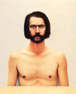
Gregory Gillespies "Self-Portrait"
(1975) |
| One of
my favorites, the "Paris Street Scene," (1972)
Richard
Estes uses the windows of a sidewalk store to reflect
the other half of the picture on to itself, creating a clever,
never-ending feel to the street. His style was a bit different
than Gillespies as you moved closer you could clearly tell
it was a drawing, but his the uniqueness of his style made a close
inspection thoroughly rewarding, more than just a detail-finding
mission. A more recent painting by Stephen Fox called "Roadside"
(1990) drew attention to a part of Central Virginia surely everyone
knows about the ubiquitous toll booth. |
|
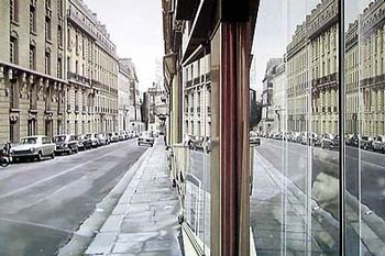
Richard Estes, "Paris Street
Scene" (1972) |
|
The last
piece I looked at was by Yukinori Yanagi, entitled "Dollar
Pyramid", (2000) a most unique work indeed. It consisted
of sections of the U.S. dollar drawn out in colored sand, encased
in plastic frames, and arranged in a pyramid. The final touch
was to allow ants to burrow through each on of the sections, creating
irregular lines, or cracks, through each of the sections. A video
documenting the entire process was shown continuously off to the
side. One can only begin to imagine the many interpretations that
can be drawn from this, but one things for sure: only in contemporary
art would it have been possible. |
|