The Comic Pop Art of Roy Lichtenstein by Juliana Rasnic

Roy Lichtenstein was born in New York in 1923. While growing up on the Upper West Side of Manhattan, he attended public school and then at twelve, he went to Franklin School, which did not offer any art classes. Despite this he taught himself how to draw, and at age fifteen he decided to be an artist rather than a scientist. His parents supported his decision and, after graduating high school in 1940, he attended the Arts Student League. He eventually transferred to the School of Fine Arts at Ohio State University where he became interested in "the difference between a mark that was art and one that wasn’t" (Tomkins 15). In February of 1943, Lichtenstein was drafted in to the U.S. Army, in which he served from 1943-1946. After the war, he returned to Ohio State University, graduating with a BFA in 1946 and a Masters Degree in Fine Arts in 1949 (Alloway 9). During this time he also worked at OSU as an art professor, a position he held until 1951. His first solo exhibit was in 1951 in New York City at the Carlebach Gallery. At this time, his work consisted of semiabstract paintings that were derivative of Picasso and Klee. His subject matter, however, was primarily knights and medieval castles (Tomkins 16).

A Brief Biography


The Lamp
Lamp

During the Fifties, he lived in Cleveland, creating art in the time he had between temporary jobs. At this time (1952-55), his art centered on the Far West and American history, which was then followed by an Abstract Expressionist phase (1957-60). This work was shown in a series of one-man art shows. In 1957, he obtained a teaching position at State College of NY at Oswego. It was around this time that images from comics began to be incorporated into his abstract compositions. Elements of his future style were beginning to emerge. Similarly, Lichtenstein painted a ten-dollar bill in a Cubist/Expressionist style in 1958. According to Lichtenstein, it was the first time he had the idea of "doing really simpleminded pictures that would look inept and kind of stupid, and the color would look at though it wasn’t art" (Tompkins 17). However, he said, "to be commercial-art-looking in an unartistic way didn’t really occur to me until 1961" (Tompkins 17). This was while he was teaching at Douglass College, Rutgers University in New Jersey. By 1962, he had an influential art dealer named Leo Castelli. Lichtenstein was now able to support himself as an artist, which caused him to resign from teaching in 1964. This independence allowed him to produce a prolific amount of work, and led to him becoming hugely successful. It was during this period that he began to produce pop art, focusing on commercial subject matter such as comic art and advertising. Due to his success in this area, two early retrospectives of his career were done by the Pasadena Art Museum in 1967 and by the Solomon R. Guggenheim Museum, NY in 1969 (Alloway 15).
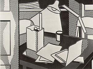
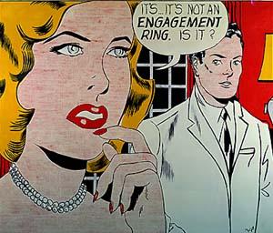
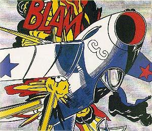
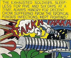
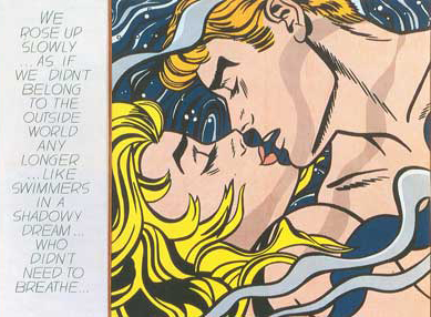
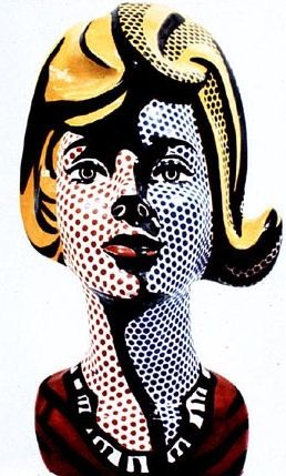
 

Lichtenstein’s Comic Pop Art


"I think art since Cézanne has become extremely romantic and unrealistic, feeding on art; it is utopian. It has less and less to do with the world, it looks inward....Outside is the world; it’s there. Pop art looks out into the world; it appears to accept its environment, which is not good or bad, but different- another state of mind."
- Roy Lichtenstein (1963)

    (Roy Lichtenstein 4)


From 1961-65, Liechtenstein quoted comic books in his paintings, creating some of the works he is most well known for. The influence of comics on his style is evident in his use of heavy black outline and a narrow range of colors, including what he called "acid yellow, dull green, purplish-blue, and a Life-magazine red" (Tompkins 19). He often applied these colors with screens in order to mimic printed reproductions. A comic artist does not need to color in his work. Instead he just numbers the areas and the coloring is done at the printer. Lichtenstein took this technique and did it by hand, creating large blocks of pure flat color. He used painted on dots to simulate the Benday dot screen used by commercial printers to achieve half tones without changing color. He also used "radical croppings and foreshortening" in order to intensify composition (Tompkins 19). Other than Andy Warhol, Lichtenstein was the first artist to repeatedly use the comics as a source of imagery and inspiration (Alloway 13). One of his first paintings in this style was Engagement Ring (1961).


Engagement Ring

This painting depicts the head and shoulders of a blond woman in the foreground with a man in a white suit standing behind her. She has her fingers to her mouth and is saying, "It’s...It’s not an engagement ring. Is it?" In this painting, he uses a screen of small benday dots for the flesh, which is patchy. A single red is used for the fingernails, the lips, the drapes, and the wall while one yellow is used for the woman’s hair and the lampshade on the opposite side of the painting. While the style is not as developed as in his later paintings, it contains many of the elements he would later perfect, specifically the use of single, pure colors, the integration of text into the image, and the benday-dot screen effect.

Engagement Ring
The Engagement Ring, 1961
Oil/canvas, 67" X 79"

The Iconography of Comic Characters

This same year Lichtenstein began making paintings using comic book characters as subjects, such as Mickey Mouse, Donald Duck, and Popeye. These comics were directly drawn from the bubble-gum wrappers that had first inspired Lichtenstein to work with found images in the same way that other artists had worked with found objects or environments. His paintings were not exact replicas of the characters, however. They were "large in scale and directly and loosely drawn" (Alloway 13). He also made minor changes in the color and form of these characters. Despite this use of classic comic characters, most of his comic paintings focus on typical scenes from comic books with incidental characters (Alloway 14). By 1962, his comic art paintings had become more complex, containing a "combination of brilliant color and narrative situation" (20). Both Blam and Takka Takka are examples of this.

Blam
Takka-Takka
Blam 1962
Oil on canvas, 68" x 80"
Yale University Art Gallery, New Haven
Takka Takka 1962
Oil on canvas, 56" x 68"
Museum Ludwig, Cologne

Lichtenstein’s paintings were subversive in the way that they combined text and image in a time when art theory heavily favored medium purity, despite Surrealism and the collage works of the Cubists and the Dadaists. Text in his paintings range from a single word, such as an exclamation like "Tex!" to longer sentences or commentary. In all of his paintings, he works from a specific drawing, but then uses that drawing to elicit a cliché that all people think about comics. Lichtenstein referred to this when he said, "I am nominally copying, but I am really restating the copied thing in other terms" (Alloway 106).

Takka Takka

This reshaping of the image for an intended effect can be seen in Lichtenstein’s Takka Takka (1962). The focal point of this painting is a machine gun with the hail of bullets emerging from its barrel. In the smoke above the gun are the words "Takka Takka." The top of the painting consists of a yellow band, which contains the words "The exhausted soldiers, sleepless for five and six days at a time, always hungry for decent chow, suffering from the tropical fungus infections, kept fighting!" (Waldman 21). Lichtenstein changed the image he was working for by enlarging the text box so that it occupied a third of the total space. This places pressure on the image, causing it to be both more condensed and more intense. He also enlarged the words "Takka Takka," modified the text and changed the dimensions of the surrounding frame. In addition to this he changed the color scheme and added his own Benday-dot pattern (Waldman 21). The result is an image that is much more complex and powerful than the original. The image expresses the chaos of war, which Lichtenstein had himself experienced during War World II. It also however draws from American comic propaganda, which was created to reassure the nation that victory would be had. By the sixties, however, it was clear that peace was not without a price as the Korean War and the Vietnam War proved (Waldman 23). Lichtenstein’s image is crafted to remind one of this.


after Romita
 

We Rose Up Slowly

This painting done in 1964 shows how Lichtenstein’s paintings of people evolved from the time of Engagement Ring. In this painting a blond woman and a man are shown embracing underwater. To the right of the image there is a text box which reads, "We rose up slowly...As if We didn’t belong to the outside world any longer...like swimmers in a shadowy dream...who didn’t need to breathe" (Alloway 10). As in Engagement Ring, the woman is blonde. In this painting, the patterns of her hair are mirrored in the patterns of the blue and purple lines of the water (Alloway 9). This creates a continuity between the elements in the composition. The text is now set apart from the image, which emphasizes the color and the lines of the image. In addition to this, the deep blue of the water lessens the harshness of the black outlines, creating a softer effect for the underwater love scene. The visual image is square, which also creates a sense of harmony because the composition is balanced both vertically and horizontally. The benday screens, unlike those of Engagement Ring, are smooth and even, and Lichtenstein is able to make minute color adjustments, which he was unable to do before (Alloway 10). The painting itself stands as a commentary on both the beauty and ridiculousness of love, in my opinion. The beauty is evident in the interplay of expression of the couple and in the thought that they don’t even need air if they have each other. The painting clearly expresses the romantic desire to be apart from the world with the one you love. At the same time, the idea of not needing air is clearly false and the exaggerated romanticism of the painting serves as a mockery of people’s illusions of love. It is these illusions that allow people to believe in such a ridiculous image to the extent that they buy it in commercial form. Lichtenstein’s subtle observation is not however of people, instead it is of the commercial landscape. He is detached, observing people through the images they accept and buy without thought. In this way, his work is a true reflection of an industrialized nation.


Sculpture

Lichtenstein began to make sculptures in 1965 while he was working on his Girls series of paintings, which included Frightened Girl and Sound of Music. At the time, the women he was painting were "hard, crisp, brittle, and uniformly modish in appearance" with "mask-like faces" (Glenn 7). He began to be interested in make-up and drawing two-dimensional symbols on a three-dimensional object. This led him to purchase two mannequin heads at a hat store near his studio. He simply painted the first one in the style of his recent paintings. The second one, however, he added a plasticine compound to in order to shape the features and the hair. These heads inspired him to collaborate with Hui Ka Kwong, a sculptor and colleague of Lichtenstein’s at Rutgers. In one year, they created six bisque heads. They also began to create sculptures of stacks of dirty dishes (for a total of twenty-six sculptures in 1965). Lichtenstein's goal with the sculptures was to "present objects we know as three-dimensional with data we associate with the two-dimensional" in order to show the contradiction between what is known and what is seen (Glenn 9). For example, Lichtenstein painted the heads with the same Benday dots he used in his paintings in order to either emphasize or diminish form, increase or decrease contrast, and omit or include real or illusory highlights. The result was what one critic described as the "first sculpture about painting" (Glenn 10). Lichtenstein’s foray into ceramic sculpture was over by the end of 1965. However, he continued to make sculptures.  
sculpture
collaborative with Kwong


He began his next series of sculptures in the late sixties when he created Art Deco-style sculpture. The first one of which was Modern Sculpture, which used industrial materials and a repetition of forms (like the Minimalists), yet was referential (unlike the Minimalists). The subject that Lichtenstein’s sculptures referred to was the Art Deco style itself in that they resembled portions of art deco furniture and architectural ornamentation of that period. He also used materials that were popularly used in Art Deco interiors such as brass, mirrored glass, and marble (Waldman 321). His sculptures of this time continue to focus on the two-dimensional as seen in their emphasis on the "flat plane and pictorial illusionism" (Waldman 321).
sculpture - art deco style
Modern Sculpture with Velvet Rope (1968)
In 1977, Lichtenstein moved into a new phase in his sculpture when he began to make "freestanding sculptural versions of motifs from his paintings of the late 60s and early 70s" (Waldman). They were mostly still-lifes as evident by such works as Lamp II and Mirror II. All of these sculptures were made out of bronze and most of them were painted again in the same style as his paintings. Furthermore, they were all sealed in polyurethane enamel. He continued to make this kind of sculpture in the eighties and nineties, creating sculptures like Brushstroke (1981) and Airplane (1990).


Conclusion

Roy Lichtenstein was a pioneer in pop art during the sixties. He was one of the first artists to appropriate comic book art and turn it into fine art. In doing so, he presented the American people with familiar heroes, couples, and icons. He did not however leave these images as he found them. He subtly altered them to increase the effect he desired, to improve the visual composition, and to reveal something about the character of the American people through the clichés they all shared in common. In isolating a single image from a comic book, he forced people to re-evaluate both the message that commercial entertainment presents them on a daily basis, and their desire for that message. In this way, he was able to forge a new type of art that reflected popular culture and simultaneously transformed popular culture into art. This social element of his work, however, was not his primary motive, which was to work with form and color both as he found them and as he choose to reflect them in his work. His focus on form is what took him beyond the two-dimensional and into sculpture where he could continue to explore the ambiguity that exists between reality and illusion. It was this space between opposites, whether it was reality and non-reality or art and non-art that Lichtenstein created some of his most stunning works.

 
Works Cited

Alloway, Lawrence. Roy Lichtenstein. New York: Abbeville Press. 1983.
Glenn, Constance. Roy Lichtenstein: Ceramic Sculpture. Long Beach: California State University. 1977.
Roy Lichtenstein: Exposition. Beau-Rivage Palace: The Chase Manhattan Private Bank. 1993.
Waldman, Diane. Roy Lichtenstein. New York: Guggenheim Museum. 1993.
Roy Lichtenstein: Reflections. Milano: Electra. 1999.
Tompkins, Calvin: New York: Arcade Pub. 1987.