|
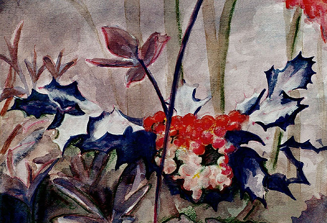
My choice of composition
was difficult because it had to be centered on ordinary objects
that one expects to be a certain color. This prerequisite
immediately eliminated most things produced by humans. In
the plastic world of today, it isn’t shocking to see ordinary
objects in new colors. Another condition I used in selecting
a composition was to avoid brown. Although there are red browns,
yellow browns, and blue browns, I found that most browns didn’t
change much when the base color emphasis was changed. So many
animal pictures were immediately out of the running. What
I chose is a simple natural composition, with leaves and berries
abound. Most people expect these natural things to fall within
a fairly limited color range. Hence, it seemed a change in
color would be most noticeable in a subject like this one.
In some ways, the result is definitely
different from reality, but in others, it is surprisingly
familiar. Initially, this composition looked strikingly different
from the original. If in a real woods, in full daylight, it
would be breathtaking to see a sea of purple leaves. But,
since this is a painting, if one imagines this to be a picture
of the woods at dusk, these colors are almost passable as
the real world. I wouldn’t be surprised to see the leaves
in a wood appear purplish at dusk, because in the back of
my head I would know they are actually green. In the end,
however, the painting does demonstrate a simple point; the
color scheme of our world isn’t necessary. We could easily
have lived in a world where purple represented lush life,
in a dense wood.
|