The box plot is a graphic which display the center portions of the data and some information about the range of the data. There are a number of variations.
The Five Number Summary Box Plot.
This is a common variant and is drawn by first finding the minimum and maximum values and the 25th, 50th, and 75th percentiles .
Then the box plot (either horizontal or vertical) as drawn as shown below:
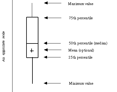
Variations on the box-plot Sometimes the whiskers on the
box-plot have a different methods of constructions, however, the hinges are are
always computed as the 25th, 50th, and 75th
percentiles.
We will make a slight detour here to examine JMP-IN's two types of box-plots and show how to use the help feature to findout what they mean.
Important The actual computation of a box-plot is not that important (that is what computers are used for), but understanding what box-plots show and how to use them is important (what computer can't do!).
Interpreting the box plot
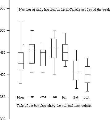
Example of side-by-side box-plot Here
is boxplot of births in a hospital in Canada by day of the week. What patterns
do you see? What unusual features are present?