Bridget Riley by Mike Talley
|
|
|
Headaches, dizziness, and nausea are all common side effects
to viewing a Bridget Riley painting. The cause of this effect
may lie in her childhood. Riley, who was born in London
in 1931, grew up with her mother in Cornwall, England.
John Elderfield explains that "her mother would take Bridget
and her sister on walks in a varied landscape and point to the
visual sensations of things-the colors, the illumination, the
elusive transitions-encouraging them to notice surprising effects"
(30). Such are the sensations of Riley's paintings: the eye
is continuously deciphering the piece, following its twists
and turns, trying to understand what it sees. Riley's extraordinary
use of color produces a radiant energy in her work; she has
continuously stated that her paintings are very much alive.
However, Bridget Riley achieved notoriety with her use of black
and white. Color both intimidated and intrigued her, and she
didn't use it for the first fifteen years of her work. Her first
applications of color in her work were mixed with gray, her
first full-color works only consisted of pure red, blue, and
green. Today, the artist uses a wide spectrum of color in her
work. This paper will explore the influences to Bridget Riley's
work, the stylistic periods of her painting, and her technique
allows the image to create "visual anxiety."
The major influences to Bridget Riley's work all contributed
to her eventual decision to work in color and the way in which
she would apply color. In 1958 Riley caught an exhibition featuring
the work of Jackson Pollock. Pollock's freely rhythmic,
vibrant, linear compositions impressed Riley. Piet Mondrian
was another influence to Riley's work. Riley especially admired
Mondrian's "Boogie Woogie" paintings,
noting that Mondrian was "putting totally at risk the stability
and equilibrium which had been central of his achievement"
(Craig-Martin 53). Riley was particularly impressed with
Mondrian's Composition with Grid: "the grid remains
constant while the lines thicken and thin and planes emerge
and recede" (Spalding 17). This helped her establish
her own line patterns in both her black and white and early
color work. Futurist painters like Giacomo Balla attempted
to uncover the inner life and emotion of lines and color; the
futurists' desire for the view to participate in the work would
also influence Riley.
|
|
Bridget Riley's work can be divided into several stages, each
stage a progression toward her vibrant and free use of color.
Her black and white period, which roughly occurred between 1961
and 1966, is where she achieved national recognition. It is
also in the black and white period where Riley was classified
in the op-art movement of the 1960s (Riley to this day does
not like the classification, she repeatedly states that she
has never studied optics). The paintings from the black and
white period are composed of geometric shapes, varying in widths,
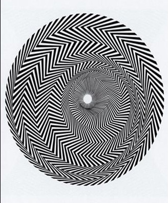
creating an optical effect on the viewer. "Blaze 1"
(1962) is an example of her work from this period. Composed
of a depth of zigzags in a circular shape, the painting radiates
intense optical energy. Many critics during this period cite
that her paintings attack the viewer. Many of Riley's designs
from this period, because of their visual intensity and popularity,
were plagiarized and reproduced commercially on billboards,
magazines, and even dress skirts. Perhaps as a response to the
disgust of her black and white reproductions in popular culture,
Riley began to gradually drift away from pure black and white,
using variations of gray tones instead. This would begin her
interest in color.
A next stage of Riley's work is a transitional period, going
from Riley's use of black and white to her use of color. This
period is commonly called the period of "Colored Gray"
paintings; this period lasted roughly from 1966-1967. "Cataract
3" (1967) is a transitional work-an opposition between
color and tone-and is described by John Elderfield as
"an overwhelming liquid flow" (32). Red and a subtle
turquoise appear in the center of the piece, surrounded by stripes
of gray paired with turquoise. A series of diagonals in the
piece emit a bright vibrance of color. According to Robert Kudielka,
"Color seems to have enabled [Riley] to proceed from the
disruptive shock of making us 'see' to the full experience of
what looking her way feels like" (18). However, Riley's
transition into color was difficult. Riley, in an interview
with Michael Craig-Martin, explains the problems with
introducing color to her work: "In my black and white work
I was dealing with staple, easily recognizable forms. If you
think of a square, a circle, a triangle, no matter what size
it may be, you know exactly what form you can expect to see.
But if you say red, yellow, or blue you do not know at all what
shade of color you will be looking at. There is no certainty,
no precise concept upon which you can rely..." (56).
Riley realized that the basis of color is instability-one never
can fully imagine the result of color interaction in planning
stages, the interaction may look one way in a sketch, but in
a large scale painting, the interaction may be different.
|
|
 Blaze 1
 |
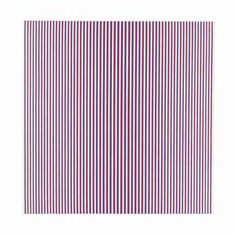
| Riley's move into complete color marks the beginning
of her "Pure Color" period, which began in 1967
with "Chant 2" and lasted until the mid 1970s.
Chant 2 is composed of red and blue stripes in opposing color
combinations: red-blue-red and blue-red-blue. Paired together
on a white background these close, thin stripes increase in thickness
towards the center of the painting. The effect is an eye-stirring
fuse of color. Violet and yellow flicker throughout the piece,
each color dynamically created with the eye by the contrasting
bands of color. Riley explains the effect of Chant 2: "The
interaction between colors is most intense when one color borders
on another. The long edges of the stripes maximize this relationship.
When placed vertically the color event is seen as a horizontal
spread of colored light" ("Bridget Riley Screenprints"). |
Chant 2
|
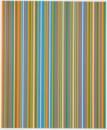
Influenced by a trip to Egypt, Bridget Riley
began a new phase of her painting, using a much wider range of
color. This period is known as the period of the "Egyptian
Paintings," and lasts roughly from the late 1970s through
the 1980s. Riley incorporated Egyptian colors into her own palette,
including ochre, brick-red, and yellow-green. The stripes in her
paintings were broader than in her earlier work: "it was
like putting a magnifying glass on an earlier stripe painting"
(Elderfield 39). This put an emphasis on the local color
in each band rather than the color collectively produced by all
the stripes. Whereas Riley before was using three or four colors
in her work, mainly the primary colors, she was now using over
one-hundred color values (Kudielka 26). "Bali"
(1983) is an example of Riley's "Egyptian Paintings."
|
 Bali
Bali
|
|
Riley's paintings morphed again into a series
termed the "Lozenge" or "Zig"
period of the late 1980s to mid 1990s. Riley's paintings during
this period are characterized by "dense, inextricably layered
structures built up piece by piece with colored papers of different
sizes" (Kudielka 44). These colored papers are rhomboid
like shapes (called "zigs" because the zag direction
is missing). "Galliard" (1989) almost resembles
a scrambled cable channel: "white loosely indicates a horizontal
counter-balance, red and orange dominate the full stretch of
the opposite diagonal, black and yellow circulate in open, unconnected
loops, and a range of blues, supported by greens and violets,
permeates the constantly shifting space" (Kudielka 36).
"Parade 1" (2000) is another example from this
period, but uses curved pieces of paper instead of rhomboid
forms.
Riley creates her paintings by designing careful, intricate
drawings and carefully observes as her assistants who actually
paint the final piece. Riley gives her assistants precise orders
and exact measurements. The project is more conceptual for her,
more brains than brawn. By delegating tasks to her assistants,
Riley can observe from afar her creation and make refinements
and decisions as necessary. She can watch the whole piece as
it is done by hand. Riley does not generally employ screen printing
or any other mechanical means to produce her work.
Bridget Riley's paintings dazzle the eye. But her goal is not
to motivate discussion about the technique of optical illusion,
but of what you get out of the experience. "I want my
paintings to exist on their own terms. That is to say they must
stealthily engage and disarm you. There the paintings hang,
deceptively simple - telling no tales as it were - resisting,
in a well-behaved way, all attempts to be questioned, probed
or stared at and then, for those with open eyes, serenely disclosing
some intimations of the splendors to which pure sight alone
has the key" - Bridget Riley
While her work may create headaches, it is
more painful to turn away.
|
Works Cited on file with instructor
|
